3 Simple Ways to Make Your Website Design More Accessible


Accessibility is a hot topic in the web design world these days. So what does it mean? Basically, making your website accessible enables all people to interact with and navigate your website. No matter who your visitors are, there’s one thing I can guarantee – they are a very diverse set of individuals. You’re going to have people visiting your website who are old, young, blind, color blind, totally deaf, hard of hearing, cognitively disabled, and more. Whether you are aware of it or not, these are your potential customers.
If your website isn’t accessible, you are essentially making it impossible for many of these people to use your website. That’s a big deal! Nearly 1 in 5 people in the United States have a disability of some sort. Not only does making your website accessible help those with disabilities, it allows you to include a wider audience of people who could buy your products and services.
To make your website is fully accessible, it must meet all of the Web Content Accessibility Guidelines (WCAG). WCAG 2.0 consists of 12 guidelines, each of which have testable success criteria at 3 levels – A, AA, and AAA. To view the full set of guidelines, visit https://www.w3.org/WAI/WCAG20/quickref/
Many of the guidelines are more technical and involved than others, but don’t let that intimidate you! Below I’ll go through 3 of the easier guidelines you can immediately apply to your website to make it more accessible.
1. Keep Your Type Contrast High
WCAG 2.0 Guidelines require that text less than 24px meet a contrast ratio of 4.5:1. For larger text (24px and up) the ratio must be at least 3:1. To check and see if your contrast meets the required ratios, you can visit this website and plug in your text color and background color: http://webaim.org/resources/contrastchecker/
Here is a comparison of text that is low-contrast next to some high-contrast text. See how much easier the high-contrast text is to read?
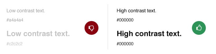
This guideline is meant to help those with bad vision and color blindness. It can also help people visiting your site in a situation where high contrast is necessary – for example, if the bright sun is glaring on their screen.
2. Don’t Forget Your Alt Text!
This is something that you likely already know about – but it’s an easy one to forget! Alt Text (short for “Alternative Text”) is most commonly used on images, but can be used on other media, as well. When you apply Alt Text to an image or other media, it does a couple of things:
- It gives screen readers the ability to read the text allowing the content and function of the image to be accessible to those who cannot see it.
- The text will show in place of the image if the image file doesn’t load or in case the user has chosen not to view images on a web page.
- It gives images a description which can be valuable for search engine optimization.
The last point, which addresses SEO, is likely why you might already know about Alt Text, but as you can see, that’s not the only reason for including it! There are two ways to add Alt Text to your images. The first is to add a caption next to your image. The second way is to use an alt tag in the HTML code of each image. See my examples below:

3. Make Your Content Easy to Read!
Your content may already meet the contrast ratio standards I mentioned above, but it isn’t going to be useful to many people if it’s formatted poorly! Be sure to make good use of headings, paragraphs, and numbered/bulleted lists to break up your content into more legible sections. The bottom line is that ALL your visitors will take in much more information if it’s easy to read. It’s hard to argue with that!
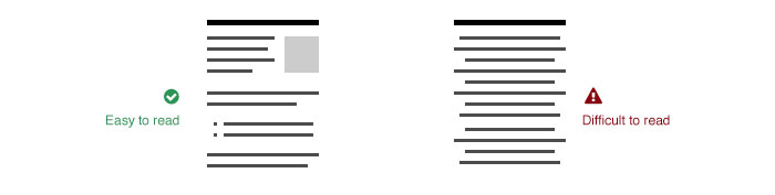
Here are a few formatting tips. Some of these are not actual WCAG 2.0 requirements, but they will still help your website be more accessible:
- Keep your paragraph width at no more than 80 characters.
- Keep your paragraphs short! 3-5 sentences maximum.
- Line spacing (leading) should be space-and-a-half within paragraphs and paragraph spacing should be 1.5 times the line spacing.
- Do not underline any text that is not a link. This can cause confusion and frustration for your visitors.
- Try not use all caps text, especially when there is a lot of copy. It’s harder to read.
- Don’t use a lot of bold text. Bold text should be used sparingly for headlines and/or important items within you copy.
- Don’t center-align or justify your content, especially body text. It’s much harder for your eyes to follow along and read content effectively.
These 3 steps will put you on the way toward making your website more accessible – but there are a lot more steps you can take! You can visit this website to view them all: https://www.w3.org/WAI/WCAG20/quickref
If you have any questions about these guidelines, or would like help making your website more accessible, you can reach out to us anytime!