When designing a website, structure is crucial. Having “good bones” will organize content in an intuitive way and provide consistency throughout the whole website. It will also, surprisingly, provide flexibility down the line for making changes and updating content. The ultimate example of a website with good structure is one with a grid-based layout. Take a look at the examples I have below:
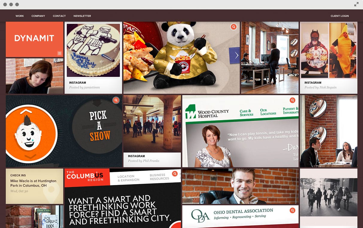
This did layout incorporates a little bit of everything from their studio – portfolio samples, Instagram photos, employee information and more. You get a quick snapshot of what they are all about and the grid layout provides flexibility for mixing all of these elements together.
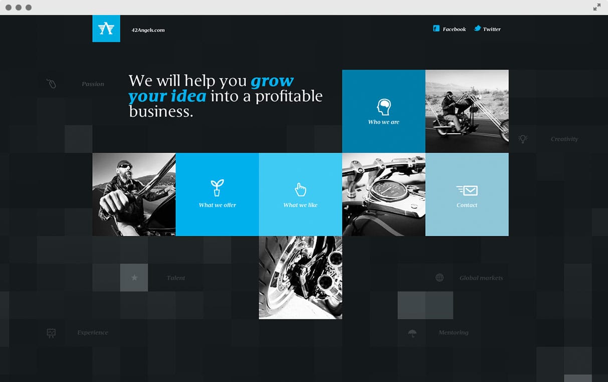
The grid structure on their home page includes a mix of text, photos and graphic in a modern, organized way. If you explore the rest of their site, you’ll see this carried throughout.
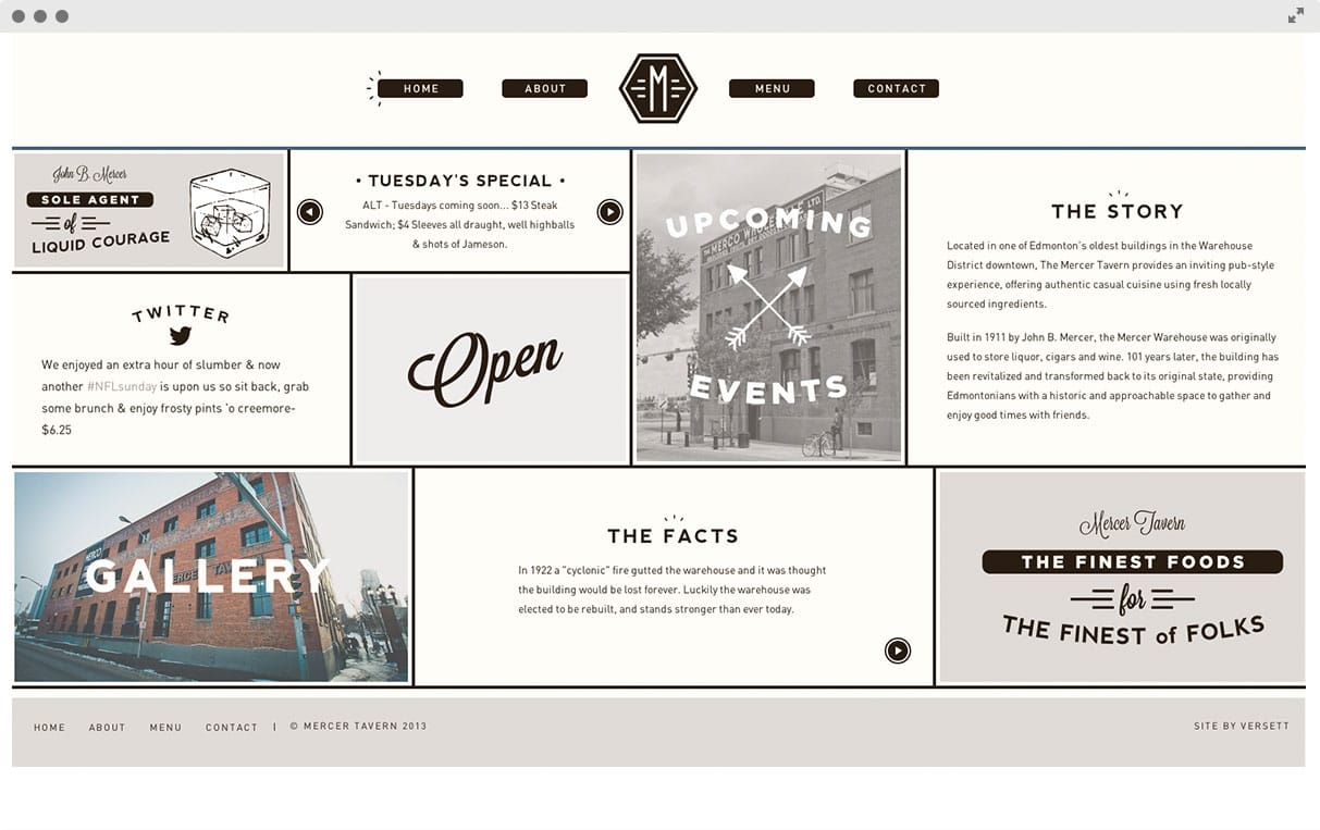
The overall design of this site incorporated modern and vintage in a really great way. The layout, the typography, the illustrations, the colors – all neat and clean. If you take a closer look, you’ll see that they are including a lot of information on the homepage, but the grid organization helps it not seem so overwhelming.
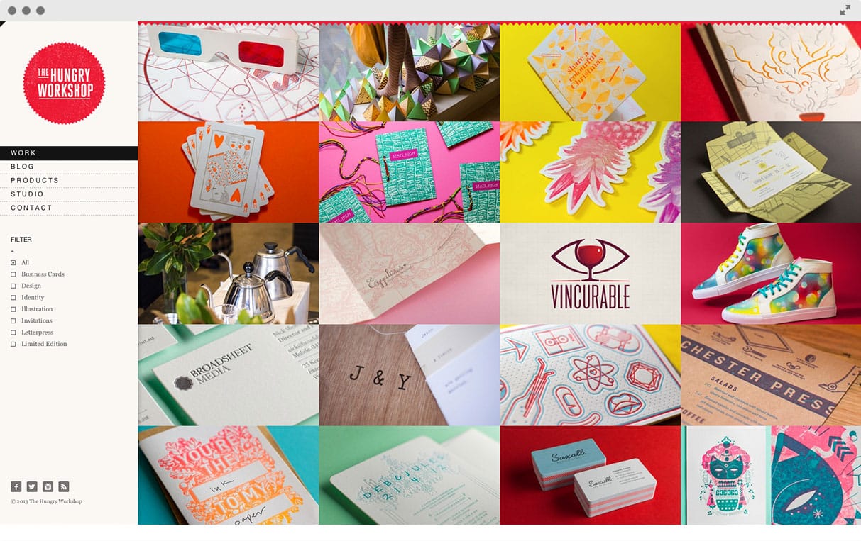
While the last example of a grid layout showed how it helped the neat and clean appearance, it’s a little different for this one. Yes, it’s neat and clean, but the effect is different because the images are so vibrant and colorful. The structure provides such a great opportunity to showcase a ton of their work in a small space while providing an over-arching mood when they are all combined.
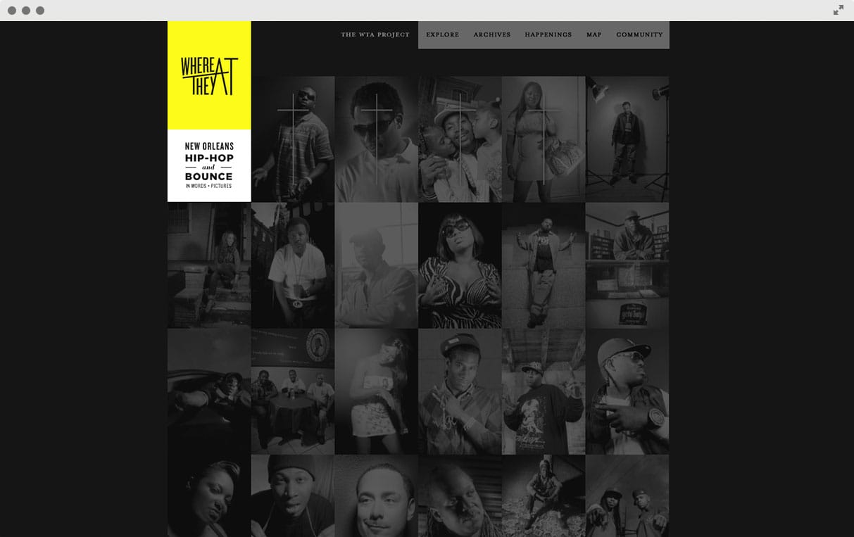
Same kind of concept as the last two, different mood entirely. The mouse-over effects make this site fun to interact with!
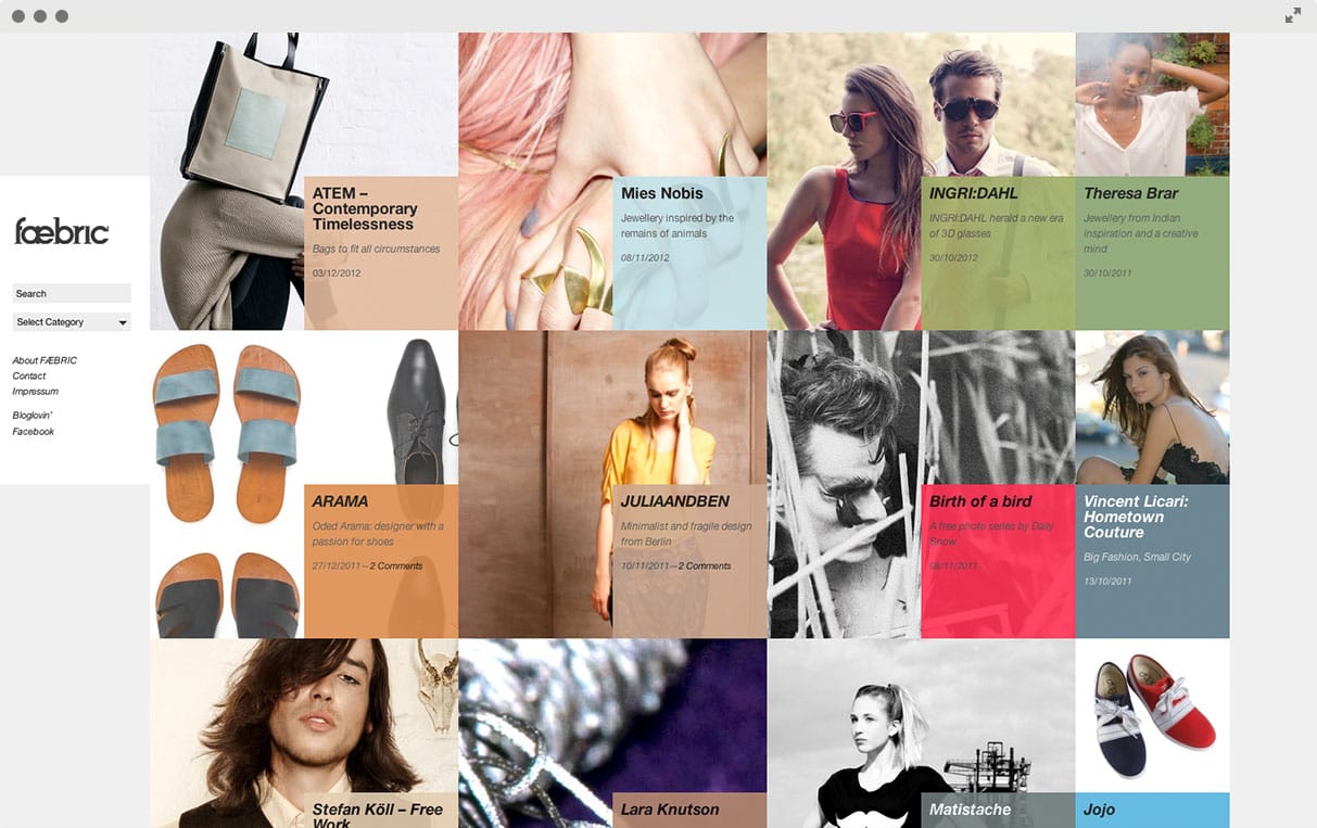
What more is there to say? I think Faebric does a great job of utilizing the grid.
—-
What do you think of the grid layout concept? I know I’m sold!