

So, to follow up on my post about why your website should go mobile, I wanted to show off some of the great mobile websites I’ve stumbled across. A mobile website is very important and putting some serious thought and effort into the design will ensure that your mobile site is a successful one.
The main challenge in designing a mobile website is the tiny screen. This small screen size limits the amount of content you’re able to show – it forces you to be smart about what information is presented and how. A mobile website should be easy to navigate and really only show the most important information to your users. Too much content (especially if it’s hard to find) can be frustrating to users which then leads to them leaving.
Below are some examples of well-designed, well-organized mobile websites:
……….
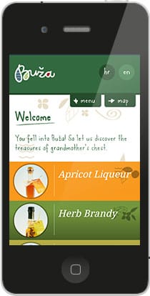
1. Buza
Buza is a shop in Croatia that sells what “your grandmothers kept locked in their chests” – scented soaps, liqueur, jewelry, etc. I think their mobile website is so well done. It’s extremely easy to navigate – the buttons are large, the menu is smooth, the text is easy to read. Also, the design is spot-on for a boutique. The rich, earthy colors really give off the sense of the atmosphere they describe.
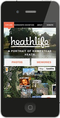
2. Heath Life
Heath Life is a website to showcase Hampstead Heath (London’s largest ancient parkland) through community photographs, writings, memories and videos. The interactive map at the bottom is a very cool feature. The overall design is great, too. The simple color palette doesn’t interfere with the images and content.
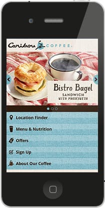
3. Caribou Coffee
I like this site for many reasons. 1. Coffee. 2. The design is so lovely. 3. There are SO many pages on this site and it’s incredibly easy to find any one of them. For example, if I want to find the nutrition information of a Northern Lite Berry White Mocha (Iced), it takes me 4 taps to get there. From there, I can then choose the size of my drink, the type of milk, type of chocolate, and whip cream to get the correct info. Nice job, Caribou!
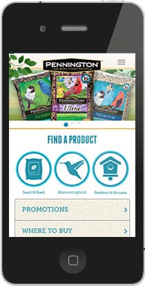
4. Pennington Wild Bird
Like all good mobile websites show, navigation is the key to success. Pennington did something a little different by adding the 3 circle icons at the top (which most likely represent the 3 most popular areas of their website) in addition to the navigation bars below. The added emphasis leaves no doubt in the user’s mind about where they need to go.
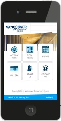
5. Vancouver Convention Centre
In a similar fashion to Pennington, Vancouver Convention Centre chose to use all icons for their navigation. I like this set-up because the icons and text make it really easy to see your options. Also, the square icons are big which makes them very thumb-and-finger-friendly.
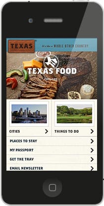
6. Travel Tex
The design and photos used on this site do a great job of giving you a first impression of what Texas is all about. The two highlighted sections at the top (Cities / Things To Do) help guide users in the right direction easily.
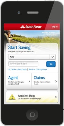
7. State Farm
This site has 4 options – Get A Quote, Find an Agent, File a Claim, and Accident help. State Farm has clearly done their research into what the most important options are and that’s all they have available. This is smart because users on a mobile phone usually go to a website for a specific purpose – adding in many more options may cause confusion or frustration.
……….
There you have it! Let us know what you think in the comments.