
So, if you’re somewhat familiar with your typefaces, you probably know that Comic Sans is somewhat of a joke. Designed by Vincent Connare in 1994, it’s was inspired by the lettering style of comic books. Soon after it was released, it’s fun, child-like appearance made it wildly popular with the world. Unfortunately, the typeface was being used inappropriately in most situations. In any good design, the typeface chosen should reflect the tone of what’s being said. When Comic Sans became popular, it was commonly being used to convey serious messages. CERN used it to present Higgs boson findings, it was inexplicably chosen for this funeral invoice, and probably worst of all, it was used on this Sex Offender Registration Office sign.
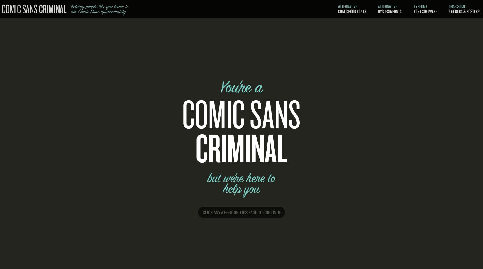
Comic Sans Criminal does an even better job at explaining what’s wrong with using Comic Sans:
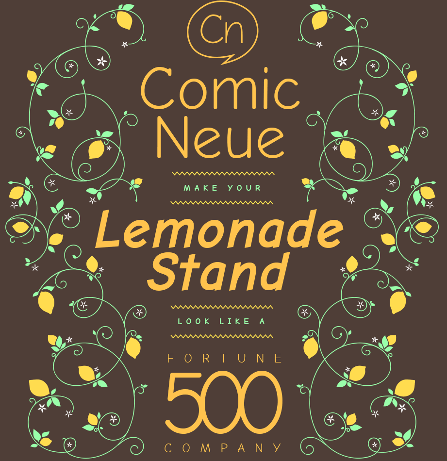
However, Craig Rozynsky, an Australian digital designer in Japan, released Comic Neue which “aspires to be the casual script choice for everyone including the typographically savvy.”
In an interview with Creative Review, Craig says:
“I simply set out to fix the weirdness. I still wanted it to be a casual typeface. I still wanted it to be Comic Sans, but a version you couldn’t easily fault. Make people question their assumptions.”
I must say, I think I like Comic Neue. I like the discussion it’s sparked and the attention it’s received. Maybe it’ll phase out the original. Maybe my parents won’t use it in all their emails anymore. At the very least, maybe it will help people understand how to use typefaces more responsibly.
A girl can dream, right?