How to Stand Out When Everything Looks the Same


You might notice something about websites today – they all look the same, don’t they? It seems that there are 2-3 standard layouts that companies decide to adopt when doing a re-design. A pretty typical formula might be:
- A horizontal navigation.
- An image or background video with large text on top.
- Three icons describing their services or product.
- Some more images and text.
- A call-to-action.
- Footer.
At first glance this might seem like a bad thing, but I would argue it has a lot of benefits. The standardization of a website interface allows for many people to immediately understand how to use your website. For example, it’s common knowledge how to use a drop down. I am a firm believer the design of a website should not interfere with the ability to actually use it.
However, how do you go about standing out from your competitors when you might all share similar layouts? The answer to that question is another question: How does your website make people feel? Your website should, at a basic level, not leave people feeling confused or frustrated (this is why using a standardized interface is good). At the very least, they should feel at ease and comfortable. At the next level, your website should be making people feel delighted and understood. So, how do you approach this?
Tell a story.
Telling A Story With Your Website
Any good story will keep a person engaged–a well-designed website will do the same. Every story has 3 parts–a beginning, middle, and end.
- Beginning: The hook. The draw. The first impression.
- Middle: Keeps people engaged.
- End: Final goal, conversion.
Beginning: How do I create a good first impression?
First, you need to figure out your audience (if you haven’t already). Who are they? Where do they live? What do they want? Work on creating content that speaks to them.
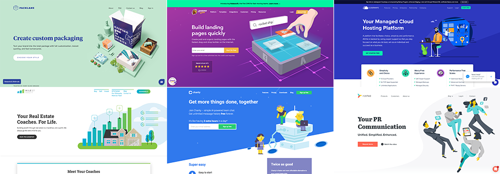
As for the design, you can go a few different ways. First, you can try the standard “formula” approach: navigation across the top, large background video with big, bold text on top. There’s a reason this is so common: it works. Your users will get a very clear impression of who you are and what you offer right away. You may also try a different direction with a very minimalist approach, or even try something a little funky (like J&P Media Labs). Both of these options would create a great first impression. (Remember to keep it usable!)

Middle: How do I keep my visitors engaged?
This is perhaps the most challenging part, but it doesn’t have to be! Here are 3 simple guidelines for creating engagement:
- Know your audience and help them to know you.
- Set a path for your users.
- Be delightful!
1. Know Your Audience
Just as with the Beginning, the first thing you’ll need to know is your audience. What do you they want from you? Make sure your content speaking to that. Not only that, though. Talk about YOU! What about your company is special? Why are you different? What is your culture like? You can tell people these things in your copywriting, but also in less literal terms. Use your brand’s colors, great photos and videos, and think about the overall tone of your website. When you tie together what your visitors is looking for with what your company provides and who you are, it helps build trust. Your users will feel that you understand them, and they will enjoy getting to know your company.
2. Set a Path for Your Users
Another important way to keep your visitors engaged is to help guide them through your website on a path. Think about what you are ultimately trying to get them to do. Do you want them to contact you? To download a resource? To purchase a product? All of the above? Put links and calls-to-action in appropriate places that will help to lead your visitors where they want to go. Each page of your site should give your users the information they’re looking for and then encourage them to keep moving along to their ultimate destination.
In addition, keep your navigation as streamlined as possible. It should be clear and intuitive – try not to use obscure words and don’t overload your drop-down menus with too many options. Removing unnecessary usability and navigation barriers will ensure your users don’t come away from your website feeling frustrated and confused.
3. Be Delightful!
Making a website delightful means to create small, magical moments that help your users fall in love with your website and product. There are several ways to achieve this, one of the most common being animation. Delightful animation can take a website from a static page to something truly engaging, memorable, and it can make your users happy! Don’t underestimate the power of happiness – it can be the difference between something that is just fine and something that people love.
So, how do you go about incorporating delightful animations? Before even getting started with that, make sure that your website has the basics of functionality covered. Adding animations onto a poorly built website isn’t going to make up for the fact that your users are going to have a bad experience. A website, first and foremost, should be useful and usable. Only then can your users appreciate the delightful.
There are lots of ways to include animation on your website. Here are a few examples:
- Loading Animations – Loading is sometimes unavoidable, but it’s also a great opportunity for something delightful. Adding in a beautiful, simple animation during loading can set the tone for a good experience to follow.
- Scrolling Animations – One of the most common approaches involves animating elements as you scroll down the page. For example, Notified triggers animated graphics as you scroll past them. This is an easy and effective way to add in something fun and unexpected.
- Hover Effects on Buttons and Navigation Elements – Hover effects are vital for good usability. Adding in some animation to them takes it to a fun new level that users love. Hop Deco has some great hover effects on their buttons, as well as their navigation items.
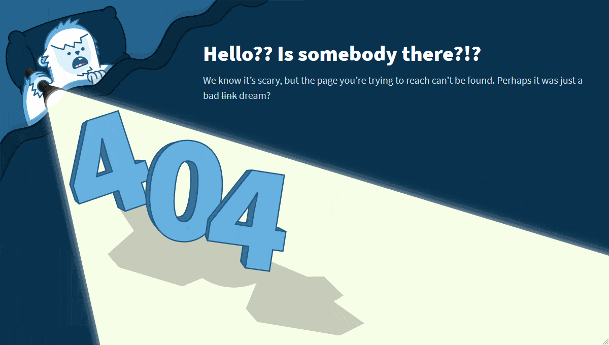
- Ease the Frustrating Effects of Errors – Mistakes happen. Your visitors will fill out forms incorrectly, or try to go to a page that doesn’t exist. Taking a point of friction and frustration and being able to turn it into something enjoyable is a great way to delight your users. For example, the below 404 page does a great job of empathizing with the lost user and helping ease their nerves.
End: How do get my users to convert?
Ideally, if you have a great beginning and middle of your story and are keeping your users engaged throughout their visit, conversion will happen. Ensure that conversion itself is easy once your users get to where they want to be. For example, a form that asks for only what it really needs will be the most effective. A form with too many unnecessary required fields will guarantee that your conversion rates drop (do you really need to know their phone number?). Don’t make people jump through hoops.
Happy, delighted, and satisfied users are users who convert.
Recap
When all websites tend to look the same, we should look elsewhere when figuring out how to set ourselves apart. Make your users FEEL something – connect with them. Maya Angelou said it well:
“I’ve learned that people will forget what you said, people will forget what you did, but people will never forget how you made them feel.”