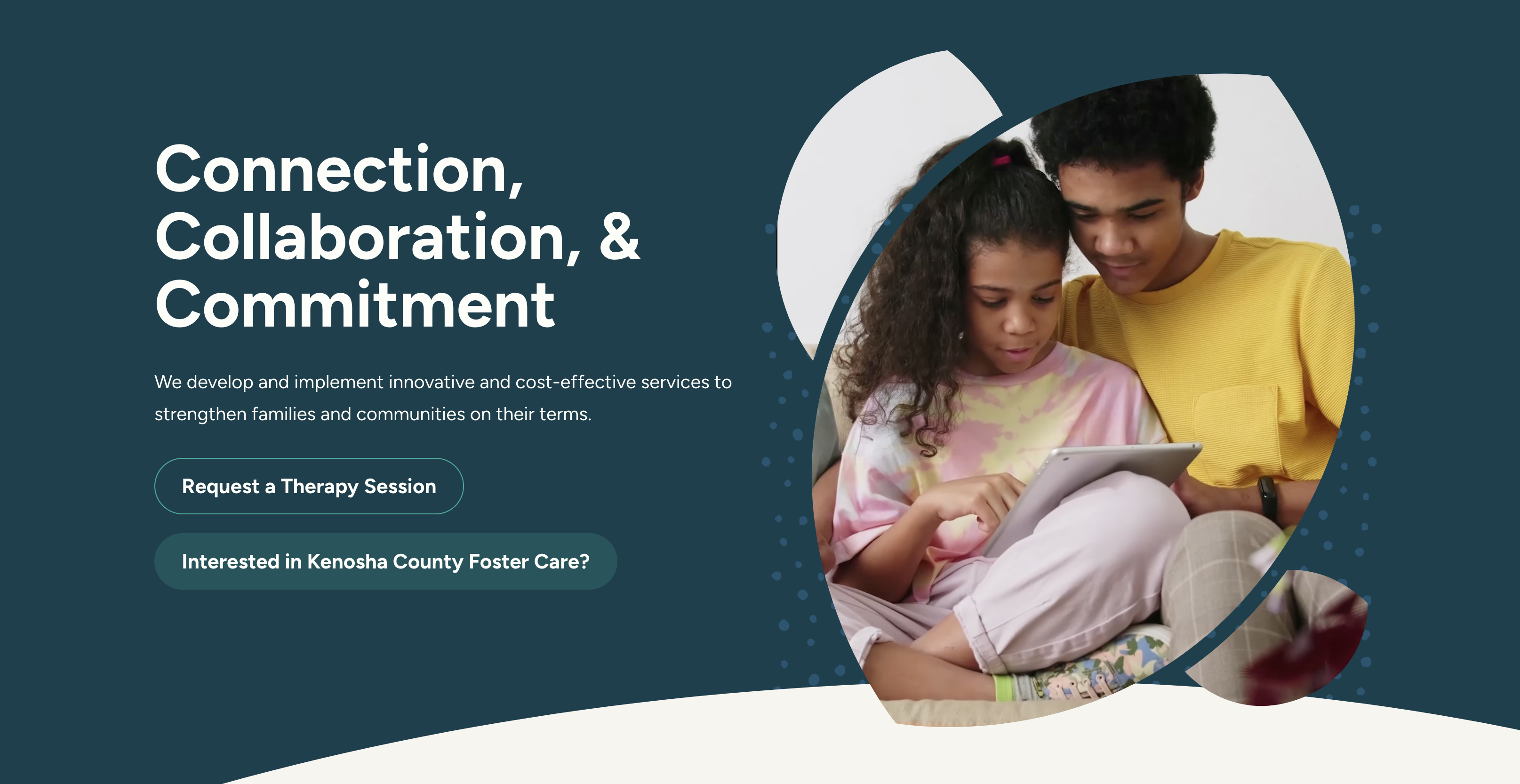
Lately, many designers have been using large-scale photography in their website designs. And I’m in love. Using large photos in websites is wonderful because it essentially forces out any unnecessary design elements and thrives on simplicity. When you add in some strong, but simple, typography into the mix you get some magical things happening. Here is a collection of 7 websites that seem to effortlessly pull off this look.
…
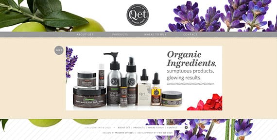
The large photos in the background of Qet (“keet”) Botanicals’ website are so stunning. Even though the photos and the type don’t directly interact here, they still work together so well. The thick, italic font really adds to the fresh, juicy feel of the design.
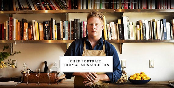
I encourage you to visit this website – the photography is wonderful. The simplistic module-like structure of the website lets all the photos speak for themselves and it’s so successful. The type really holds it’s own, too. The serif font works so well with the style of photography – it adds class, sturdiness and character.
Ah, Milk & Pixels. Your lovely logo looks so wonderfully lovely over the fuzzy city photo in the background. *Swoon*
![]()
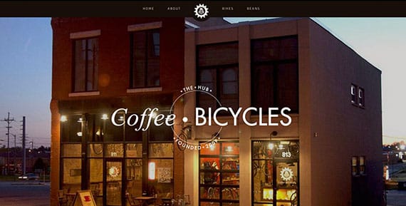
Coffee and bicycles, you say? What more could you ever need? The stunning nighttime photo of their building combined with the simple (but gorgeous) type on top makes me feel like I could spend some serious time at The Hub.
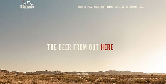
Even though Big Bend Brewing Company is located in Texas, this website makes me think of the Outback in Australia. The dry, hot desert atmosphere of this photo immediately makes me feel the need to quench my thirst – with a beer, of course. The simple, clean typography on top does nothing to interfere with that and it works so well.
Teehan + Lax adds a bright blue filter over the top of the background photos. Add in the classic type on top and I know right away that these are smart people. I mean, they have to be, right? This website does a great job at making a first impression with potential clients.

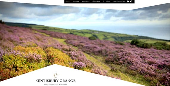
Photo + Angles + Simple Site Design = A Thing of Beauty. Like Life & Thyme, the photography here is remarkable. The whole site is photo-based and combining the photos with a strong serif font really says “luxury” to me.
…
Well, I hope you enjoyed the collection! Do you have any websites to share? Let me know your thoughts in the comments.