

The list of devices used to access online content continues to grow. The fact that your website is accessible by virtually anyone at any time sounds great! However, if your website is unable to adapt to a variety of screen sizes, it can quickly lose its effectiveness and even result in negative consequences. Luckily, there is a solution and you’ve probably heard of it… responsive web design!
What Is Responsive Web Design?
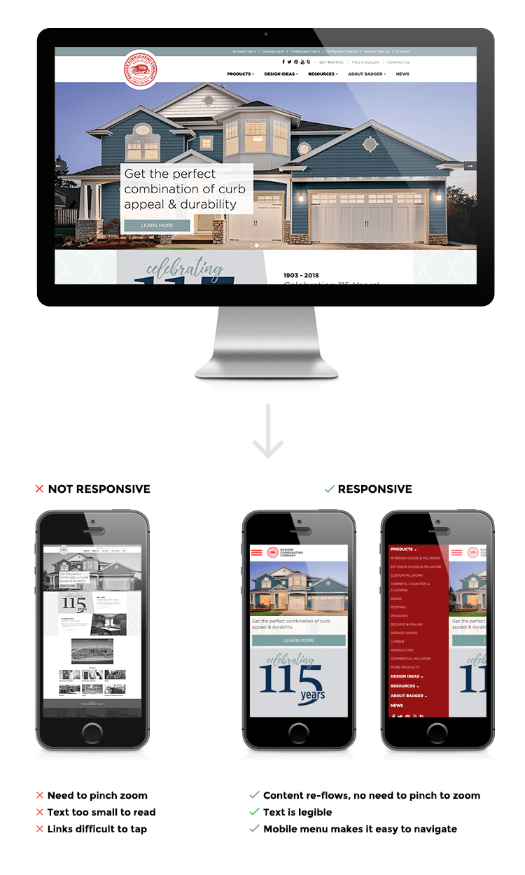
Responsive design provides the flexibility needed for a website to adjust its layout. This shift happens dynamically depending on a visitor’s screen size. While the layout will vary among devices, the same website is always being viewed. This means there is no extra work required when it comes to content management.
Impact On User Experience
Approximately 50% of all website traffic is performed on mobile devices. Not accounting for this segment of visitors can negatively impact their experience with:
• Horizontal scrolling
• The need to zoom in
• Issues selecting links
• Poor readability
Research by Google has shown that when users encounter a website that is not mobile friendly:
• They are 59% more likely to leave the website and try somewhere else
• 43% feel frustrated or annoyed
• 53% agree that a frustrating experience hurts their overall opinion of the brand
On the other hand, when users encounter mobile friendly websites:
• They are 75% more likely to visit the site again
• They are 65% more likely to buy
Impact On SEO
There are a few different reasons why a mobile responsive website is likely to rank higher on Google searches.
1) If you’re familiar with the Blog Effect, then you already know: increased traffic boosts your website’s rank. But how would a responsive website increase your website traffic? As discussed above, mobile friendly websites lead to more positive and engaging user experiences than those that are not. This boosts the probability of first time visitors returning to your website rather than bouncing and never coming back.
2) Unlike some mobile solutions, responsive design maintains the same domain across each device and does not duplicate content. This is viewed as a positive by search algorithms.
3) Because Google says so! But really, Google has decided to rank sites optimized for mobile screens higher in all searches with their Mobile-first Index.
How To Be Responsive
Congratulations! You have already completed the first step towards creating a responsive website. How? You took the time to learn about responsive design, its importance, and therefore recognize your organization’s needs. But what now? Well, the answer will be a little different for everyone.
If you already work with a developer, speaking with them would be a good place to start. Depending on the state of your current website, they may recommend working with the existing code or starting from scratch.
If you maintain the website yourself via a prebuilt theme, check to see if the creators have released any updates. If not, there are other options for going mobile. Keep in mind, the right option will vary depending on the type and size of your organization:
• Switch to a new theme
• Find a developer to help edit your current theme
• Utilize a plugin
• Build a new website
If you don’t have a website at all or already know you need a new one, check out our new website planning guide!