Give Your Forms Some Love! Tips and Best Practices for Online Form Design


I believe that many people underestimate how important web forms can be. Forms are a crucial area of interaction with your visitors–it requires effort on their part and can easily become frustrating and laborious. Since people are typically filling out forms for a specific purpose and not just for fun, it’s important that they be easy to use! The better your forms, the higher your conversion rate. So give them a little love! They’ll love you right back, I promise.
Forms come in all shapes and sizes!
What kinds of forms are there? Lots.
- Contact forms
- Job application forms
- eCommerce checkout forms
- Event registration forms
- Sign up / Log in forms
- Forms for filtering and searching
Common problems with online forms
Without proper thought and attention, forms can get messy. Here are some common issues:
- Visually poor, intimidating
- Asking too many questions
- Not helpful, or confusing
- Don’t anticipate problem areas
- Hard to read
- Not accessible
How do we make them better?
There are plenty of solutions to making your form the best it can be. The goals should be to make your forms
- Easy & Fast
- Smart
- Trustworthy
- Reassuring
- Accessible
- & Mobile
Let’s jump in.
Make your forms EASY & FAST
Your form doesn’t need to be a big, intimidating wall of fields. There are so many ways to make your form easier to fill out–and when it’s easier, it’s faster. When it’s faster, people are much more likely to convert. (Yay, leads!)
Group like items together
Fields like addresses, contact info, payment, previous employers, attendee info, etc. should be grouped together. Going one step further, add some space around each group to keep them visually separated and organized. This will make it easier to fill out and lead to less confusion.
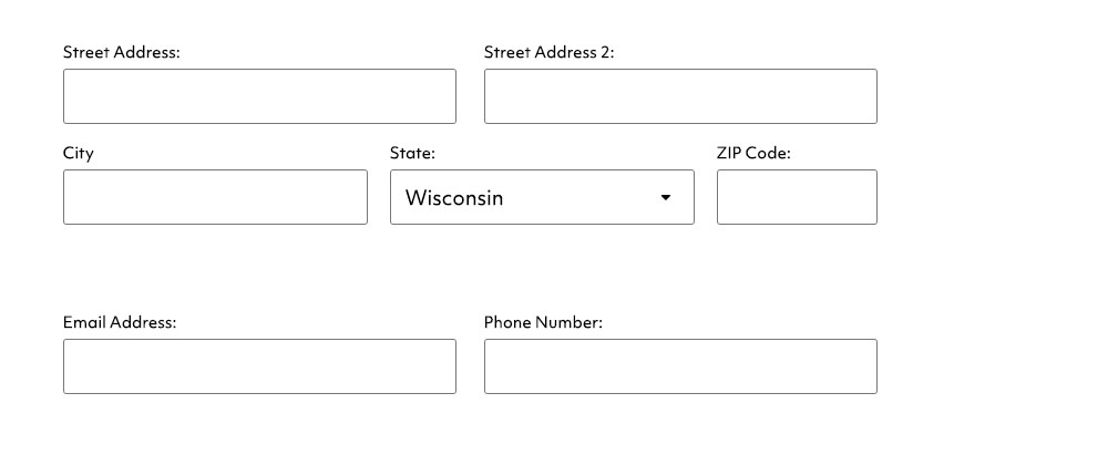
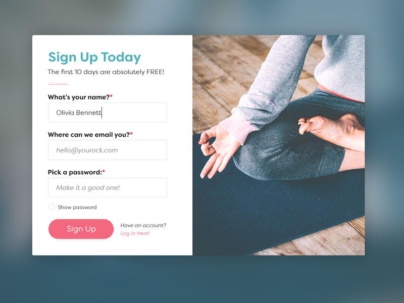
Size fields for their input.
When all the fields are the same size, they can blend together. When you size them for their content, your users can quickly glance over the form and know what it’s asking for. For example, a field should be small for zip code, long for street address (see above example).
Submit buttons should be large and easy to spot.
The submit button must be large enough to be found without issue. Bad forms use text links or small submit buttons that can be hard to locate – that’s not an ideal user experience! Not only can it take more time to find it (every extra second has an impact!), it takes some frustration out of the experience.
Field labels should be large enough to easily read.
Text must be large enough for all eyes to read it! Imagine trying to fill out a form when you can’t read what it’s asking you for. Your field label text should be no less than 14px, but ideally 16px or more.
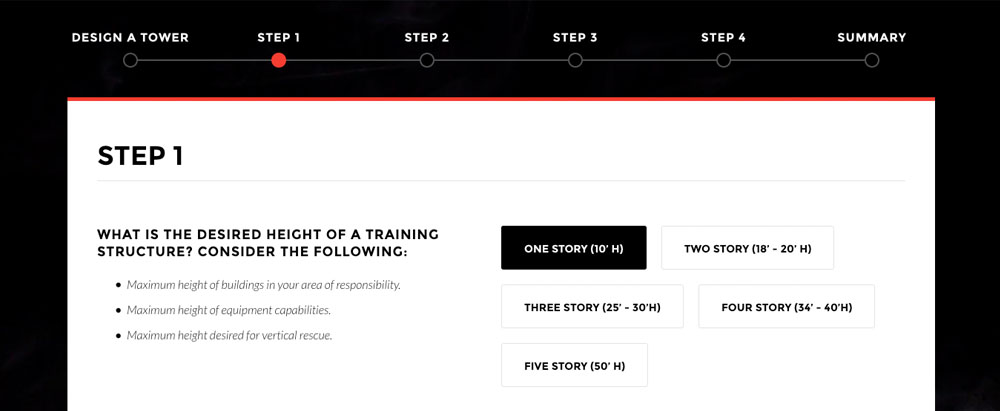
For very large forms, break them into steps.
Some forms are going to be long, there’s no getting around it. When this happens, you can try breaking it up into steps so your users can work on one section at a time. Include Progress Indicators and Waypoint Markers so users know how many steps there are AND what step they’re on.
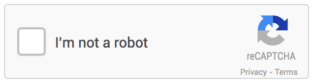
CAPTCHA’s – Just Say No!
You’ll almost always experience some sort of spam from your online forms. However, making it more difficult for your users to submit their information is not the solution. If you need to use some sort of method for stopping these spam attacks, avoid the hard-to-read CAPTCHA’s! Try using Google’s reCAPTCHA – it’s as simple as clicking a checkbox.
Keep field labels above the fields, not beside them.
If you format your form with the text labels above the fields, the human eye is going to have a much easier time scanning through the form and filling it out.
Keep it as simple as possible!
Do you really need to ask for your users full address? Do you actually need their company name? A lot of times, the answer is no. If you don’t need it, don’t ask for it. The longer your form, the less submissions you’ll receive.
Any optional fields should be clearly marked as such.
If you must include fields that are optional, add a label that says they are optional. Your users should know they have a choice.
Make your forms SMART
Put some thought into how people will use your form–I guarantee there are multiple smart ways to make your form even better!
Choose the right type of input
If you have fewer than 10 options for a question, consider using radio buttons or check boxes instead of a drop-down. It removes a level of complexity and allows your users to answer faster.

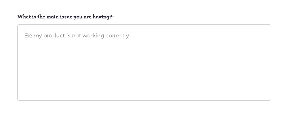
Use defaults & hints where they make sense
It can be very helpful to fill in certain fields right off the bat so your user doesn’t have to. If you are asking for a date, for example, you could pre-fill it with today’s date if that makes sense.
You can also have what is called “hint” text within a field. It provides a little more clarification and context to the question. Remember, though, that this text will disappear once they start typing, so don’t put crucial information in here (all crucial information should be outside of the field so it is always displayed).
Predictive Answers & Search Suggestions
These are helpful if you have a good idea of what people may be searching for right off the bat! It’s also useful when your question has a large amount of predetermined answers–your users can just start typing to narrow them down and select the one they need.

Make your forms TRUSTWORTHY
Everyone is concerned about online privacy these days–and rightly so. Make sure your users feel comfortable sending you information.
Be sure your form is secure and be sure it’s apparent
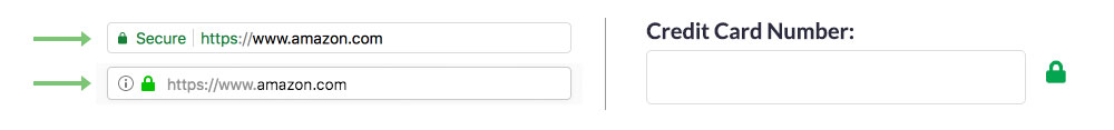
First things first–your website should have an SSL certificate. An SSL certificate protects any and all data being passed through your website (including your admin log in form!). In addition, Google uses it as an SEO ranking factor. You can get a FREE SSL certificate from https://letsencrypt.org/, so it doesn’t even cost you anything. Once your site is secured, your browser’s URL bar will show that it is safe with a green padlock icon.
Another way to help your users know your site is secure is to use the lock icon on form fields where sensitive information is entered. It’s a gentle reminder that their data is in good hands.
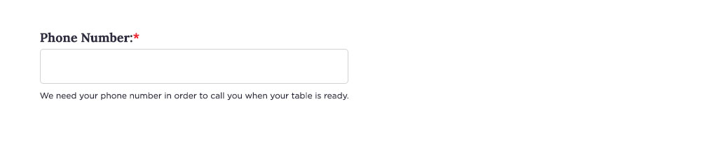
Tell people why you need their information
Like I mentioned previously, it’s important to only ask for information you need. If you need some sensitive information, explain why and what you are going to use it for. This is especially true for things like social security numbers, or credit card numbers if it isn’t completely obvious why you need it. However, people are even wary about giving out phone numbers!
Make users Opt IN
Don’t trick users into signing up for your newsletter by having that checkbox selected by default – allow users to opt-in by checking it themselves. Making them click to opt-out feels manipulative.
Beautiful Forms Gain Trust
The more clean, organized, and easy-to-use your form is, the more people will trust it! Spending extra time on improving your forms is worth it.
Make your forms REASSURING
Even the best forms can be fail at the end if not done properly. All sorts of questions can go through somebody’s head when they submit a form (“Did my question go through? How do I know? What’s taking so long? Do I need to press submit again?”). It’s important that your form reassures your users that it is working correctly and their submission has gone through.
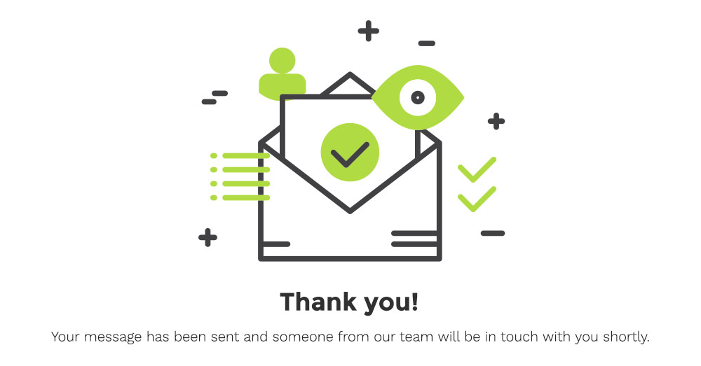
Give them confirmation
When someone completes your form, take them to a confirmation page that tells them what happened (“Your message has been sent!”) and what will happen next (“Someone from our team will be in touch with you shortly.”).
Send a confirmation email
Sending a confirmation is standard for online shopping transactions, of course, but many more forms would benefit from a quick confirmation email. When a user schedules an appointment, send them the details. When somebody requests more information, send them an email letting them know it’s on the way. When a job application gets submitted for an opening, be sure to send an email saying you received their application and will update them soon.
Prevent multiple entry errors
Once user hits Submit, the button should then turn a different color and become un-clickable. This will prevent the user from submitting the form multiple times (possibly causing errors). In addition, by changing the button’s color, they understand that they’ve already clicked on it and something is happening.
Make your forms ACCESSIBLE
Accessibility is crucial in all aspects of your website, forms included. It’s estimated that 20% of the population has some kind of disability and a significant portion of them have a disability that makes it difficult to access and use the internet. These include visual, hearing, motor, and cognitive disabilities all of which have different implications for using websites. There are simple things you can do to include this group:
Form should be clear and intuitive
From the WebAIM website:
“Forms should be clear and intuitive. They should be organized in a logical manner. Instructions, cues, required form fields, field formatting requirements, etc. should be clearly identified to users. Provide clear instructions about what information is desired. If any form elements are required, be sure to indicate so. Make sure that the order in which form elements are accessed is logical and easy.”
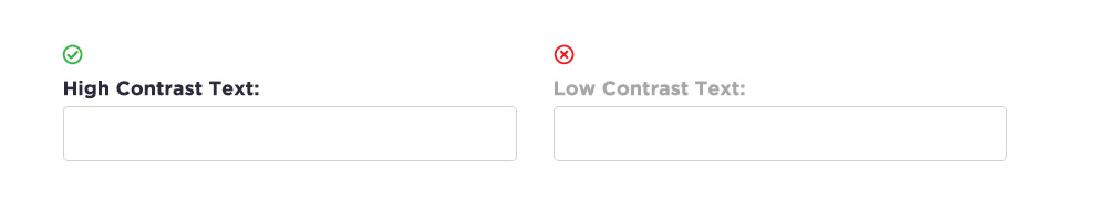
High contrast is important
To help ensure those with color blindness or other visual impairments can better see your content, be sure you choose colors that will have a high contrast ratio. If you need to test your colors to be sure, head here.
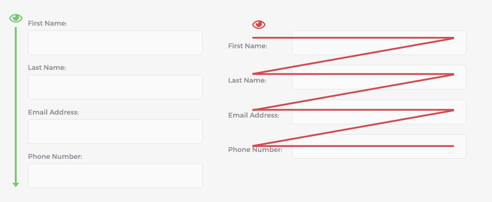
Make the form function without the use of a mouse
This is a big one: if you can’t move through the form (and submit it!) with only the use of your tab button, you are excluding a lot of users from being able to use it.
Ensure it works in all recent browsers and devices.
Test your form in different browsers and devices to see that it’s working how it should. People use many different ways to access the internet!
Make your forms MOBILE
Expanding more on my last point – mobile users need to be able to use forms, too!
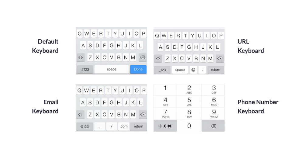
Use the correct keyboards
When a user needs to enter their phone number, a specific keyboard can appear for that. Nothing is more frustrating trying to enter a phone number with the standard mobile keyboard! There are plenty of different keyboards you can use and they make the process much more pleasant.
Make the fields tall enough
There are fingers of all shapes and sizes out there. Form fields and buttons need to be big enough to easily tap with small or large fingers. The standard is a minimum of 48px high.

Watch your text size
Text should be larger on mobile – 14px appears quite smaller on a phone than it does on a laptop. Keep it above 16px.
As you can see, there are lots of points to consider when putting together a good form. Believe it or not, this list doesn’t even cover them all! Overall, the general theory is make them as easy, as minimal, and as usable as possible. I hope these tips are helpful for you in creating your future forms or improving existing ones!