2020 was … a year. There is so much to be said, but I think I am going to leave it at that.
2021 is on the horizon and I was thinking about some of the bigger trends I noticed lately in the web design world. So, without further adieu, here are 5 of my favorites.
1. Accessibility
This has been the biggest one for us here at Powderkeg. We have been talking a lot about accessibility for the last year or so and it seems there is always something new to learn! Here are a few blog posts we’ve written that you can look back on for some of our biggest tips:
- Web Design Accessibility Tips: 3 Ways to Make Your Website Navigation More Accessible
- What goes into making an ADA Compliant and Accessible Website Design?
- Accessibility Tip: Make Your Website Keyboard Accessible
- ADA Accessibility: Common Questions and Answers
2. Simple Animation
With today’s animation techniques, the sky is the limit. However, just because we can doesn’t always mean we should. I’ve seen plenty of sites that go a little overboard with animation and scrolling effects and many times it gets in the way of using the website. Not good!
More and more I’ve been seeing websites combine bold designs with a touch of animation for maximum impact. Here are some great examples:
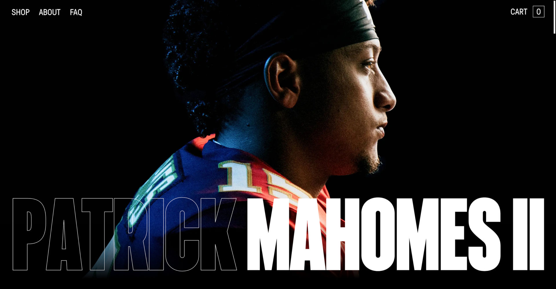
Patrick Mahomes Website: I love that this site actually has very little animation, but it feels like so much more! The very large, bold design adds significantly to that feeling.
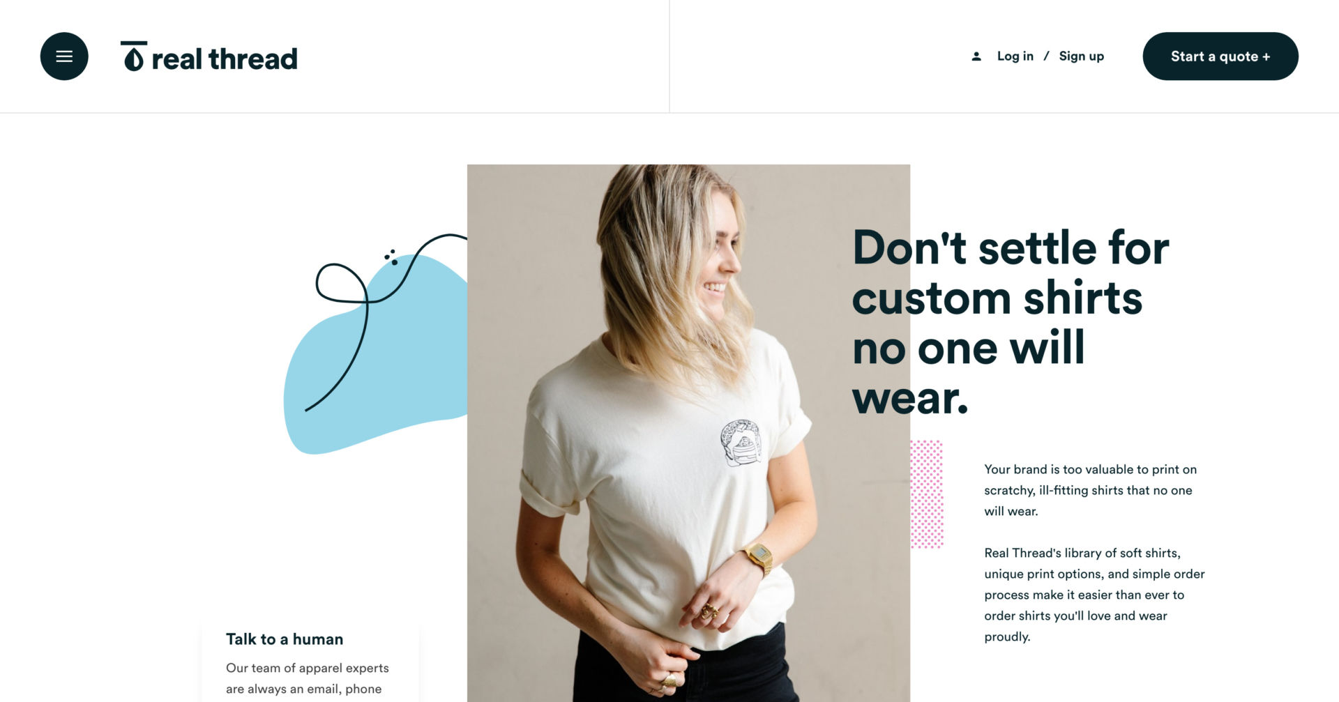
Real Thread Website The animation on this site is fantastic. Everything sort of “reveals” itself as you move down the page and I think it’s a great example of animation having a big impact, but not getting in the way of usability.
3. Asymmetry
This one has been around for a while, but it doesn’t get old! Designers have been pushing the limits on this and I’m continually impressed by the asymmetrical designs I see these days. Here’s just a few great examples:
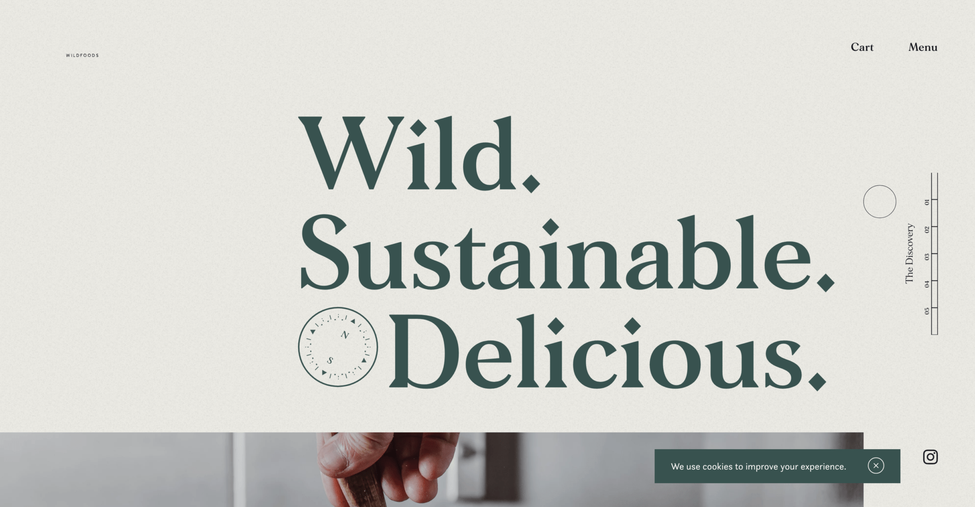
Discovered Wildfoods
The asymmetry throughout this site is just beautiful. It’s so different while also remaining balanced. They also do a great job of simple animation throughout the site.
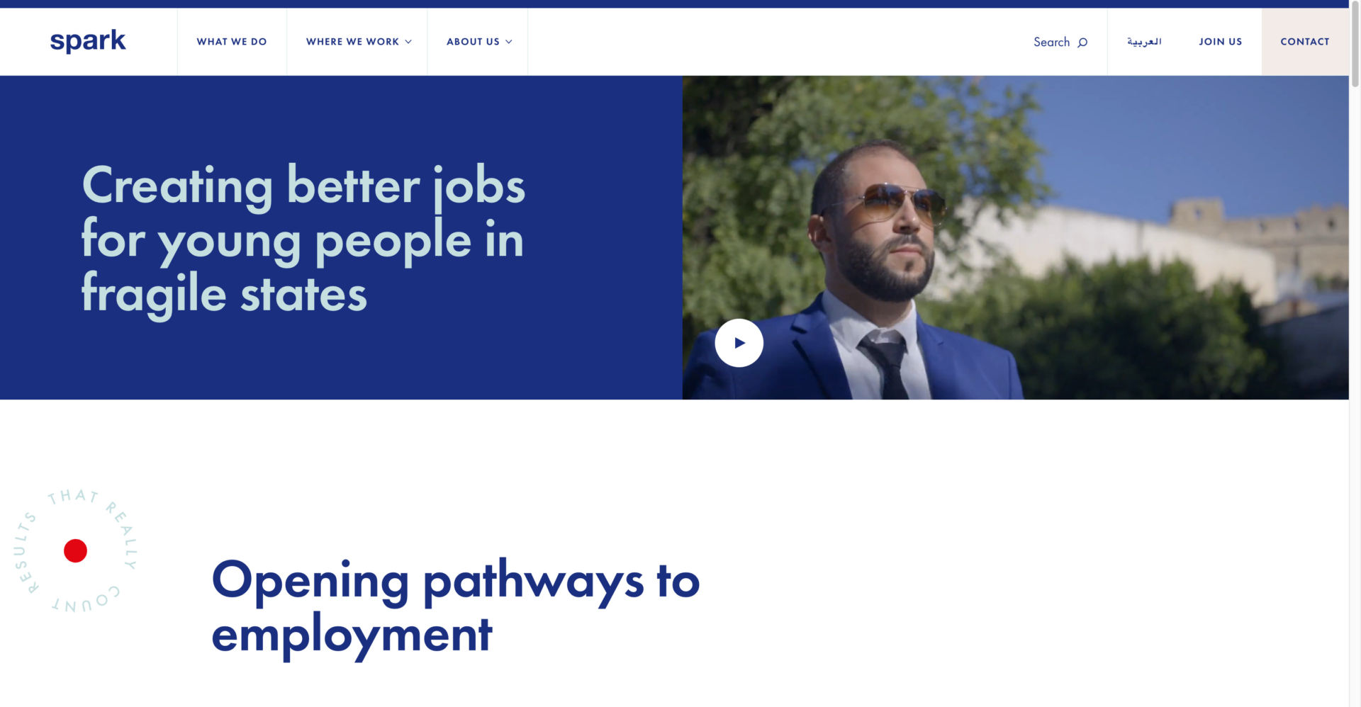
Spark: This website does a great job of utilizing a more standard grid, but also having elements that break out of that grid. I love the way they pulled that off.
4. Text First, Images Second
I love this design strategy because it truly puts your content and value directly in front of your users’ face. It also is a great way to stand out because the majority of websites these days have the standard full-page-image first. Here are some examples:
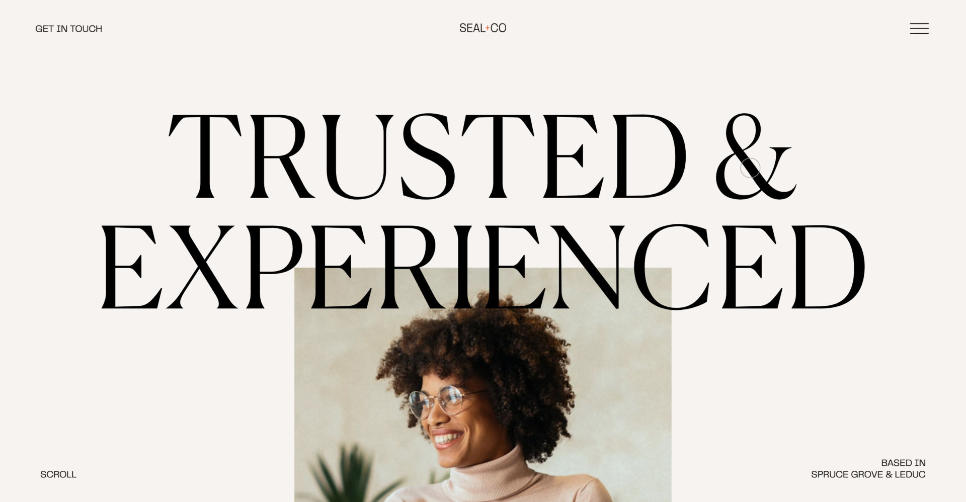
Seal & Co.: Can you tell what they want to convey to their target audience? Maybe that they are…. trusted and experienced? At some point, somebody probably asked “How do we tell our audience how trusted and experienced we are?” Sometimes the obvious answer is the best answer – put that text right in their faces! When you have this very large text above that featured image with plenty of white space behind it, your eye has no choice but to go right to it and read it immediately.
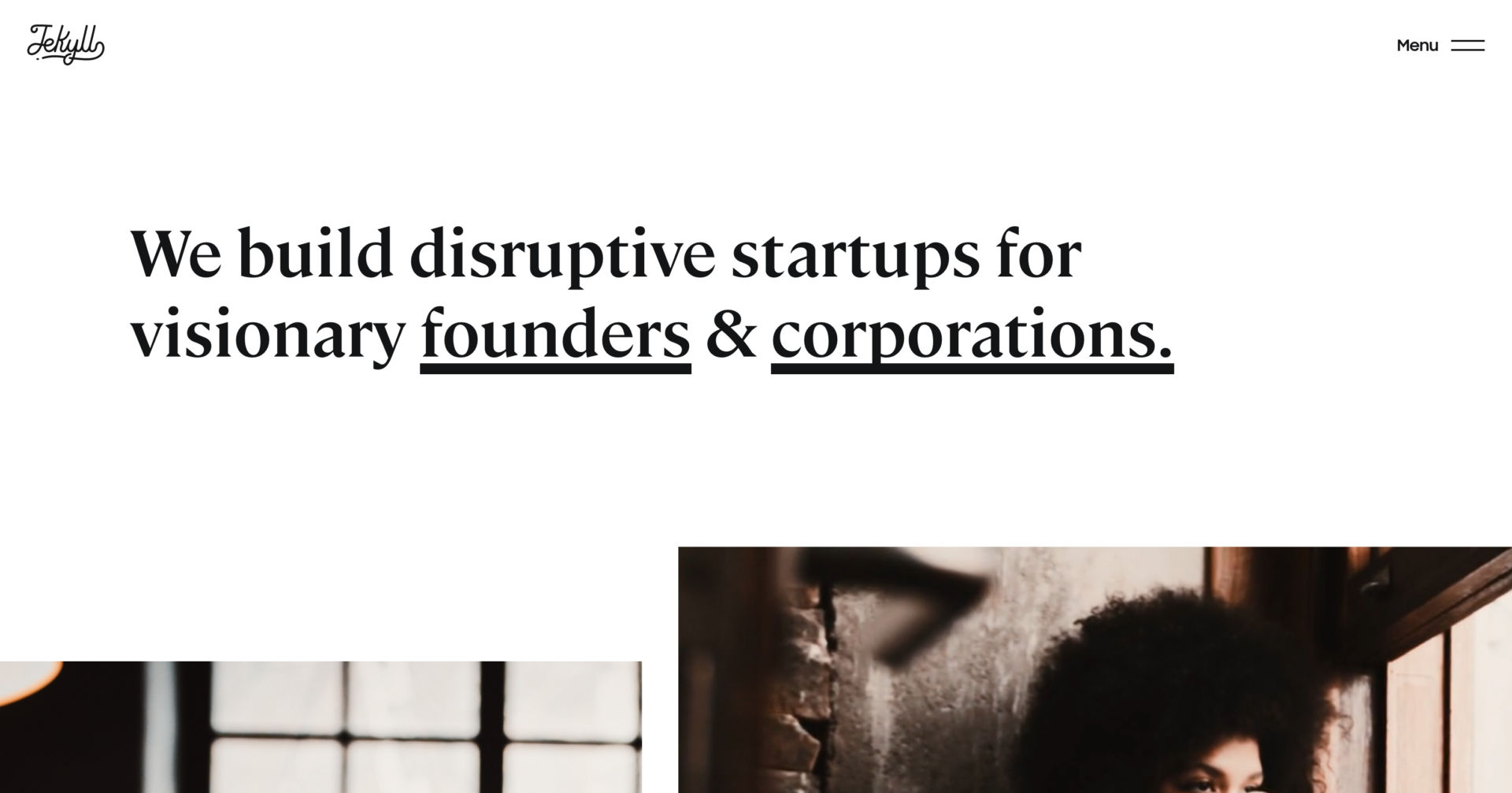
Jekyll: Another great example – the large, bold text on just white space guarantees your users will read that text because there is nothing else truly competing with that.
5. Serif Fonts & Muted Color Schemes
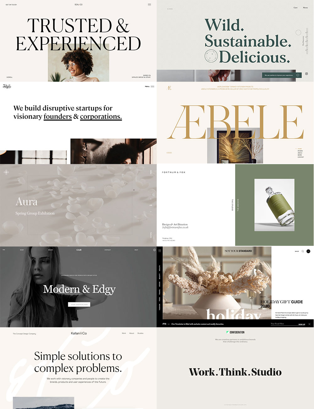
This type of web design aesthetic has caught my eye a number of times lately and I’ve started to take note. This muted approach to color mixed with these bold and flared-serif fonts is a beautiful combination, in my opinion. The colors are relaxing, the fonts feel luxurious but also curiously different. I’ve put together some screenshots of several sites I’ve found like this:
We hope you have a wonderful and safe holiday season. I know I’ll be happy to kick 2020 out the door and usher in a new year.
Cheers!