Website Design Accessibility Mini-Audit: Child & Family Development

Welcome to my new blog post series: Website Accessibility Mini-Audits! I’ll be showcasing some of my favorite, or least favorite, websites and walking through a few basic accessibility guidelines to how these sites do at following them. So, here we go!
I am going to evaluate this website based on:
- Color Contrast
- Keyboard Navigation
- Forms
There is, of course, a lot more I could analyze in a full website accessibility audit. (If you need one, let us know!)
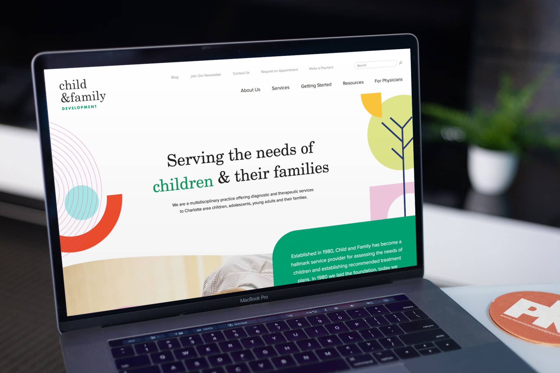
Child & Family Development
I found this site a while ago and I love it so much that I keep it bookmarked in my browser! They really nailed the fun, playful design of their site, and I can tell they have done some work on their accessibility, as well.
“Established in 1980, Child and Family has become a hallmark service provider for assessing the needs of children and establishing recommended treatment plans. In 1980 we laid the foundation, today we continue a tradition to develop our community, foster integrity and continually create progress.”

Visit Child & Family Development Website
Color Contrast
When I am looking at color contrast, I am specifically looking at the color contrast of text and/or images of text. WCAG Guidelines on use of color state “The visual presentation of text and images of text has a contrast ratio of at least 4.5:1.” The intent of this guideline is “provide enough contrast between text and its background so that it can be read by people with moderately low vision (who do not use contrast-enhancing assistive technology).” There are some exclusions. For example, logos and decorative graphics are not included. In addition, large text (roughly 18px and larger) must only meet 3:1 contrast ratio.
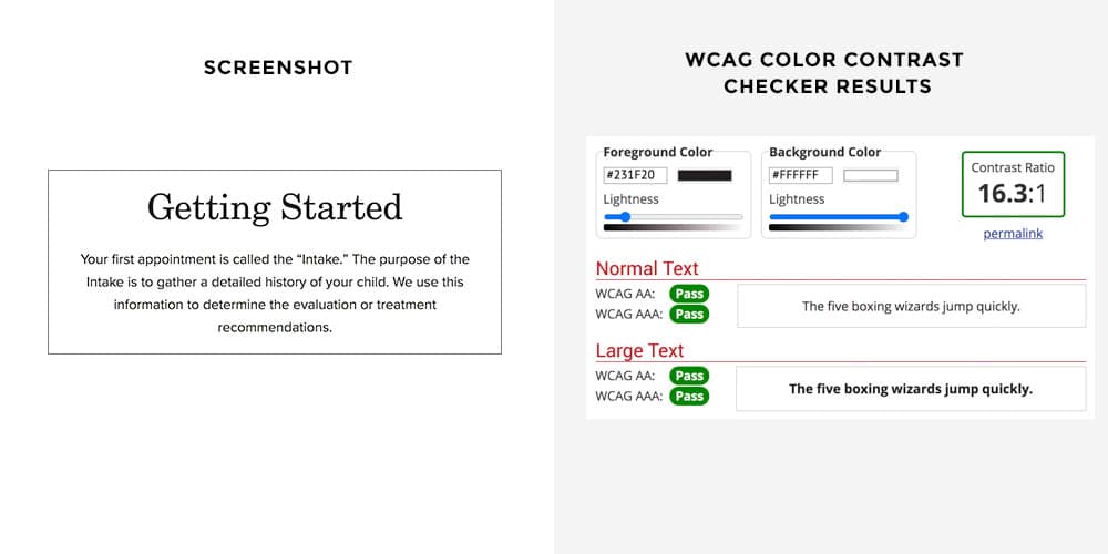
Overall, Child & Family Development does a good job. A majority of their content uses a black color on a white background, so no surprise there! Contrast ratio are easily met.
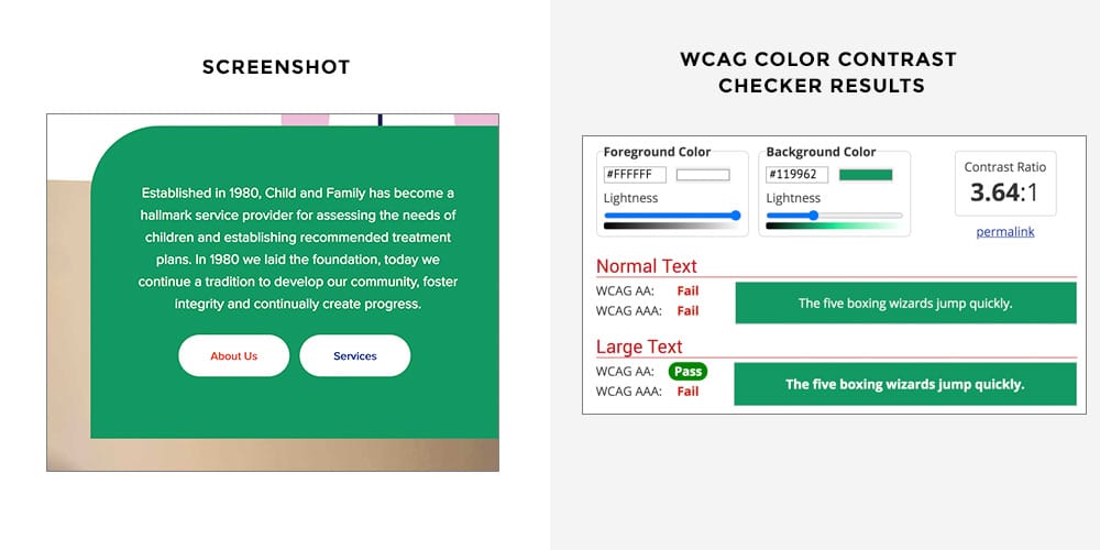
It almost looks as if this white text on a green background fails, but it doesn’t! This text is 20px, so it’s technically considered “Large Text”. In that case, you can see that it passes the ratio requirement for WCAG AA guidelines.
However, I did see in a few spots throughout the site, there is text around 18px which is just on the cutoff and is considered “Normal Text”, so in those spots, it technically fails.
Same thing here. This text is large enough to be “Large Text” and passes the AA requirement.
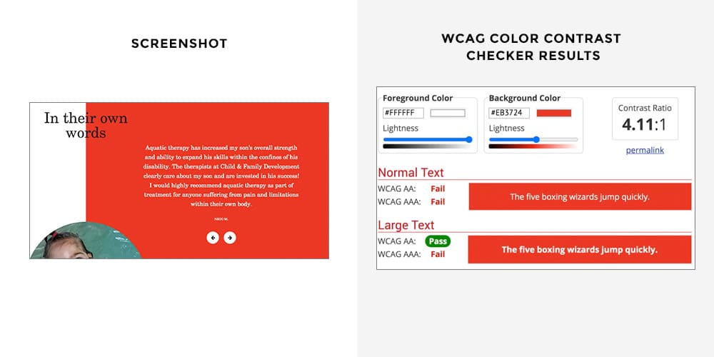
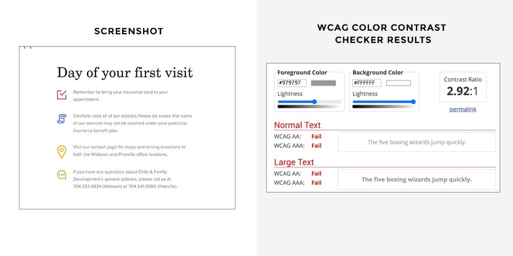
Here is where they could use work. A lot of their important content is this light gray color and it fails to meet any of the ratio requirements.
Keyboard Navigation
Keyboard navigation is SO important! There are many people who have motor impairments that make using a mouse impossible. In addition, people who are blind or have a severe vision impairment will use a screen reader which means they cannot use their mouse to see where to navigate. Lastly, there are many people who prefer to use their keyboard rather than a mouse to navigate.
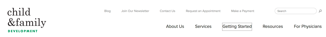
So, how does Child & Family Development do? Overall, pretty good! To test this yourself, go to the website and don’t click anywhere! Instead, hit your Tab button. You use the tab button to jump from link to link, sequentially down the page. A typical problem on un-accessible websites is that you’ll get “stuck” in the navigation and not be able to jump into the main content by using the tab button (this is obviously problematic.).
C&FD allows me to easily tab through every single item in the navigation and you can clearly see a focus indicator around each item to know exactly where you are (see the box around “Getting Started”):
One main problem is that as I continue to tab through the links, I get a little lost within the large image carousel. I lose my focus indicators and it’s difficult to control the carousel. If I just keep hitting the tab button, I eventually get through it and the rest of the page works well.
Forms
I am going to take a look at the Contact form. They are doing most things correctly here. However, one big issue I have is with the color contrast of the fields themselves. The light blue box on a white background does not provide sufficient color contrast to ensure that these fields are plainly visible for those with visual impairments. I would suggest that they add a dark border around each field to fix this issue.

Here’s something they are doing correctly that makes me happy. Look at how obvious this form error is! Yay!
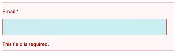
When I submit this form without filling out a required field here, the website clearly tells me “There was a problem with your submission. Errors have been highlighted below.” Each field with an error has a light red background and red text – this makes it obvious where the error is to people who no vision impairment. For people with vision impairment, they might not even be able to see that light red and if, for example, they are colorblind, they may not be able to tell that the border/text is red. So in addition to that, they have added text below it that says “This field is required.” Screen readers will be able to read this, as well.
My Mini-Audit Accessibility Score: B+
Not bad! There really are a few simple fixes that could be implemented to improve accessibility, but overall they’re doing well!
Stay tuned for more Mini-Audits.