Icons are one of my favorite web design elements. They are an effective and attractive way of supporting your content. When a user first visits your website, they take only a few seconds to scan everything and decide if it’s worth their time to stay. Therefore, having some visual interest on your website will draw users in will be very helpful. Let me show you some great examples of icon use in web design and I will explain why they work well.
These icons are front and center with their high contrast and page placement. It would be very difficult for anyone to overlook them. They immediately bring the user in to read the text under the icons which gives them an immediate idea of what Pagoda Box does.
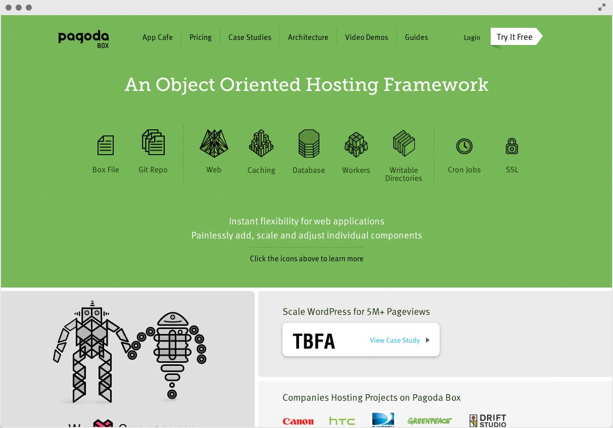
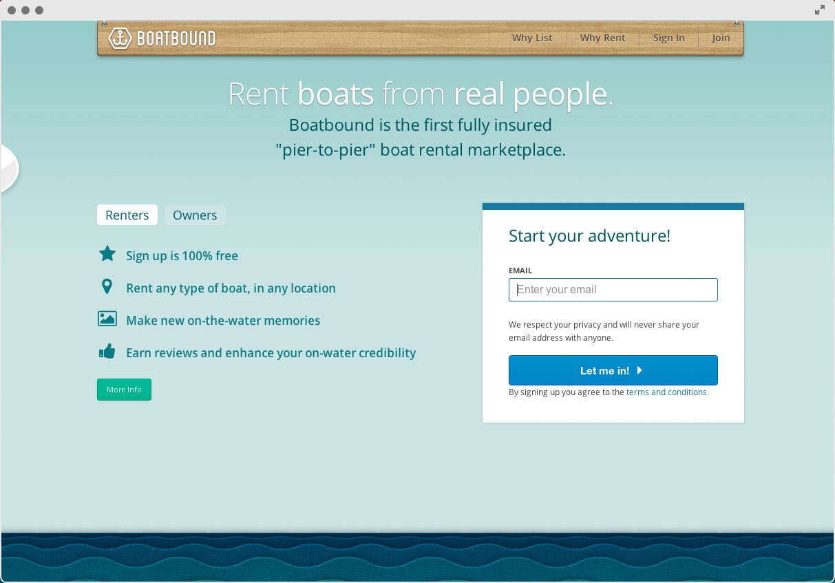
The icons here are super simple and make the feature list easily digestible.
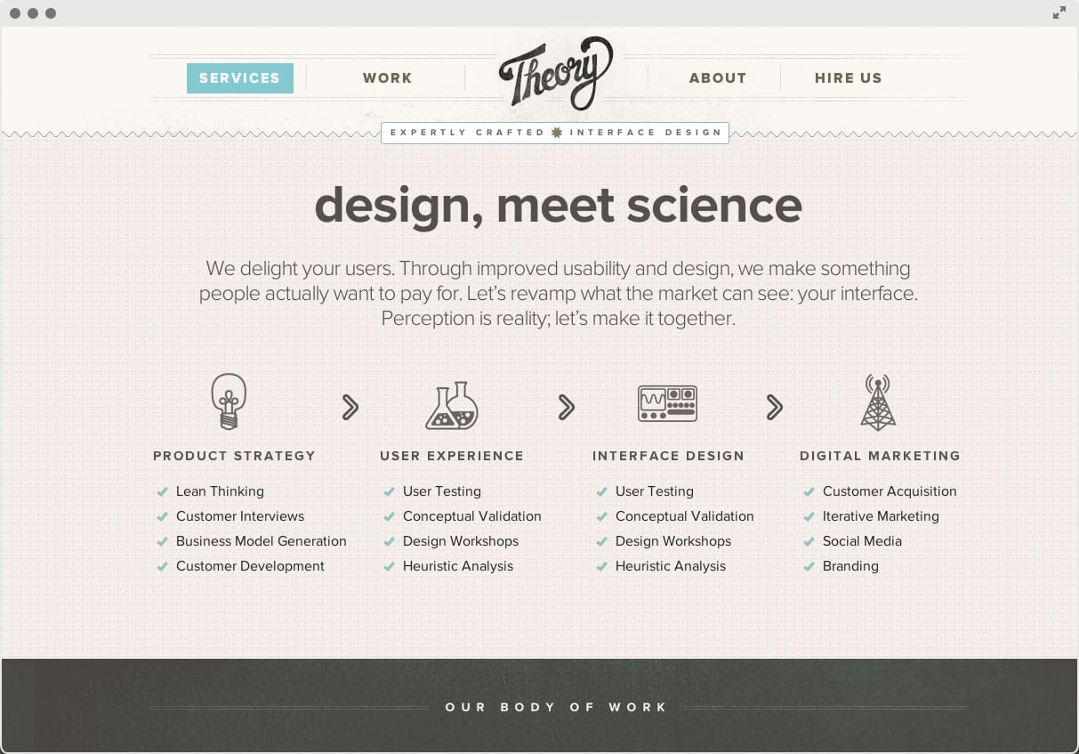
Theory’s icons fit really well into the design of the rest of their site. The hand-drawn look of the main icons really help users visualize their process and the check marks in the lists below help legitimize their services.
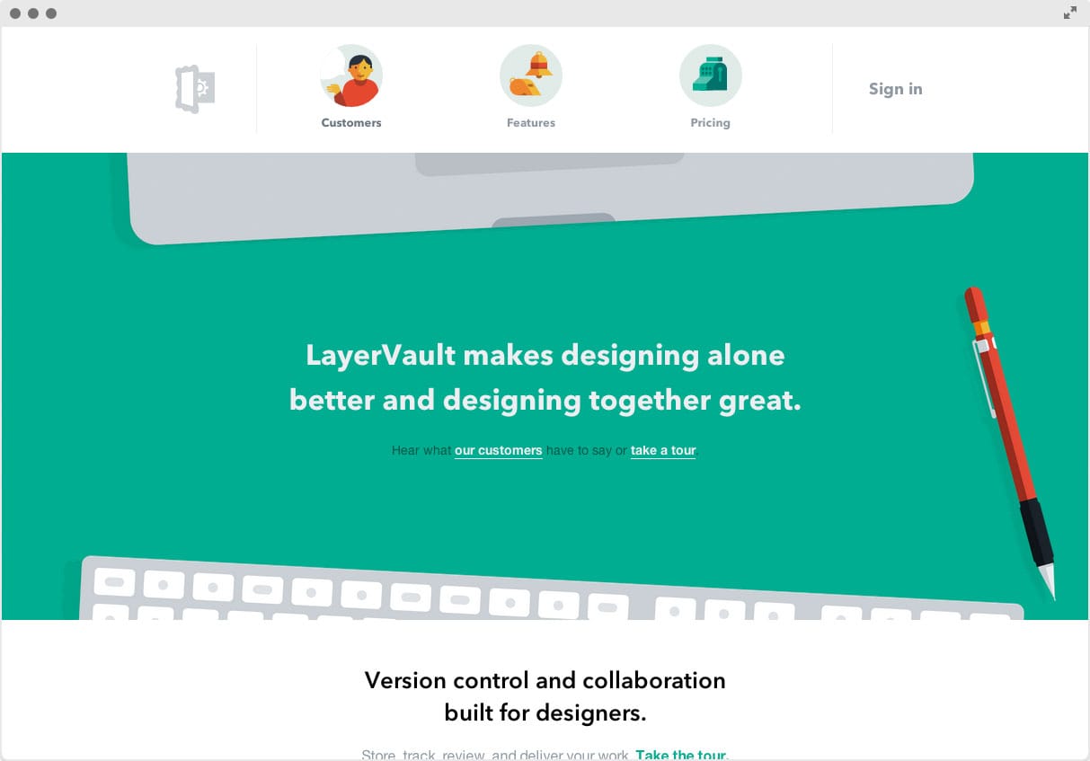
LayerVault uses some custom icons in their navigation. This runs the risk of complicating the ability to navigate the site, but they avoid this by adding text underneath each icon. They use other icons (that are animated!) on their site, so I highly recommend visiting to see for yourself.
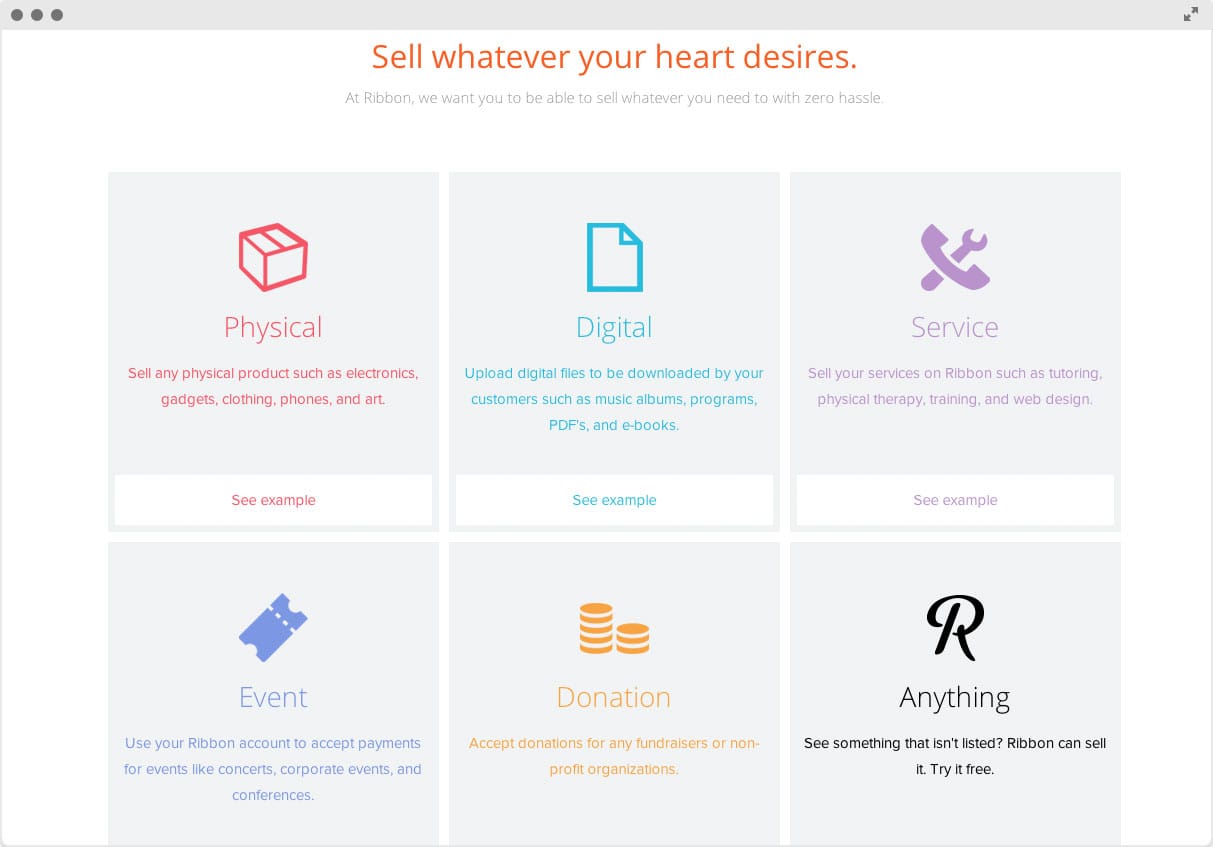
To help visually demonstrate the services that Ribbon offers, they use simple, large icons and a short blurb of text. There are many sites that do this and there’s good reason – it works!
There you have it! Big, small, flat, 3D, color, black & white – you name it. Icons work! What do you think? Let us know in the comments!


