Website Design Accessibility Mini-Audit: Parramatta Park (Video Edition)


Welcome back to my blog post series: Website Accessibility Mini-Audits! I’ll be showcasing some of my favorite, or least favorite, websites and walking through a few basic accessibility guidelines to how these sites do at following them. So, here we go!
In the spirit of Disability Awareness Month, I am going to walk through a site today that I feel really nails it! There’s a lot I could go through on this particular site, but I’m going to focus on my favorite parts:
- Navigation Bar
- Color Contrast
- Forms
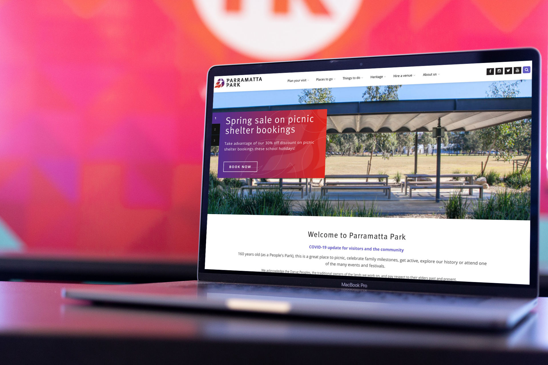
Parramatta Park
I was so happy to stumble across this website because there are so few that I think truly have an accessible experience. Here’s more about this Australian park:
“Parramatta Park is 85 hectares of green open space featuring historic sites and attractions, sports fields and ovals, established gardens and remnant bushland, picnic spots and playgrounds, memorials and monuments, waterways and wildlife, cycleways and walking tracks.”
Visit Parramatta Park’s website ›
Watch my video walk-through here, or skip it and follow along below!
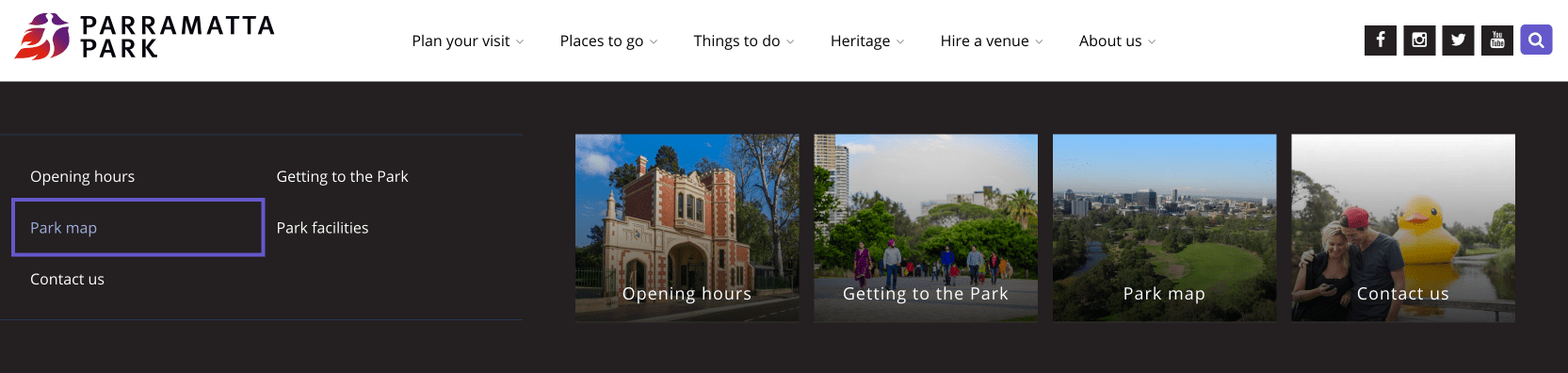
Navigation Bar
I may or may not have freaked out a little bit after discovering that this website’s navigation bar is fully operable by keyboard only! No keyboard traps! I can use the drop-downs! Focus indicators! Skip to main content!

Let me tell you what I mean:
When I’m looking to see how accessible a website is, the first thing I typically do is go to the website and use my keyboard to navigate. If a site is very easy to navigate with a keyboard only, that likely means that there has been some serious thought put into accessibility. It also means it is more likely to work very well with screen reader technology. What I most commonly find is that the navigation can be hard or impossible to get through without a mouse. Parramatta Park’s website, however, does a great job. Here are my favorite things:
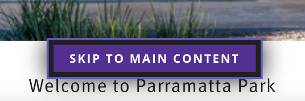
Skip to Main Content
When I land on the website and use my TAB button, a “SKIP TO MAIN CONTENT” button appears. It appears towards the bottom of the screen and is very visible. This allows keyboard and screen reader navigators to jump to the main content quickly and easily without having to go through the entire navigation menu first.
Focus Indicators
As I tab through the navigation, the purple focus indicators make it very clear right where I am in the menu! I find that so many websites either get rid of these or make them so faint they are barely noticeable. It’s incredibly helpful when these are clear and obvious because otherwise there is no visual indicator of where you are on the page (which is what a mouse gives you).
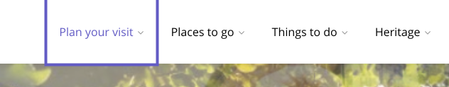
They continue throughout the main content, too.
Drop Down Menus
The best part about this navigation, in my opinion, is that it is incredibly easy to use the drop-down menus with your TAB key and arrow keys. In my experience, this is rare. If you want to try it yourself, use your TAB key to get to “Plan Your Visit” and then hit your Down Arrow key. You will see that you can jump right into that menu and get to any link you need.
Color Contrast
Ensuring your text and other important elements have high enough color contrast is one of the most fundamental accessibility changes you can make on your website! This is one of the easiest ways to ensure that your content is legible for those with any kind of visual impairment – whether that’s color blindness, blind spots, blurry vision, or even those who are in a situation that makes reading difficult (a bright sun on your mobile phone screen, for example).
Parramatta Parks’ website has great color contrast throughout. I appreciate that they didn’t let this limit their design and they continued to be visually creative. For example, in the top feature section with the rotating carousel on the home page:

The background color behind the white text is a nice gradient with some graphics on top! This can be especially challenging to keep text very legible with those kinds of extra design elements, but they totally pulled it off!
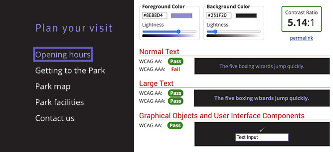
In their footer, they have some purple text on top of a dark gray background. When I first saw that, I was sure that this color combination did not meet WCAG ratio guidelines – but I was wrong! I plugged the color values into the WCAG Color Contrast Checker Tool and lo and behold… it passes both AA guidelines, as well as AAA Large Text guidelines.
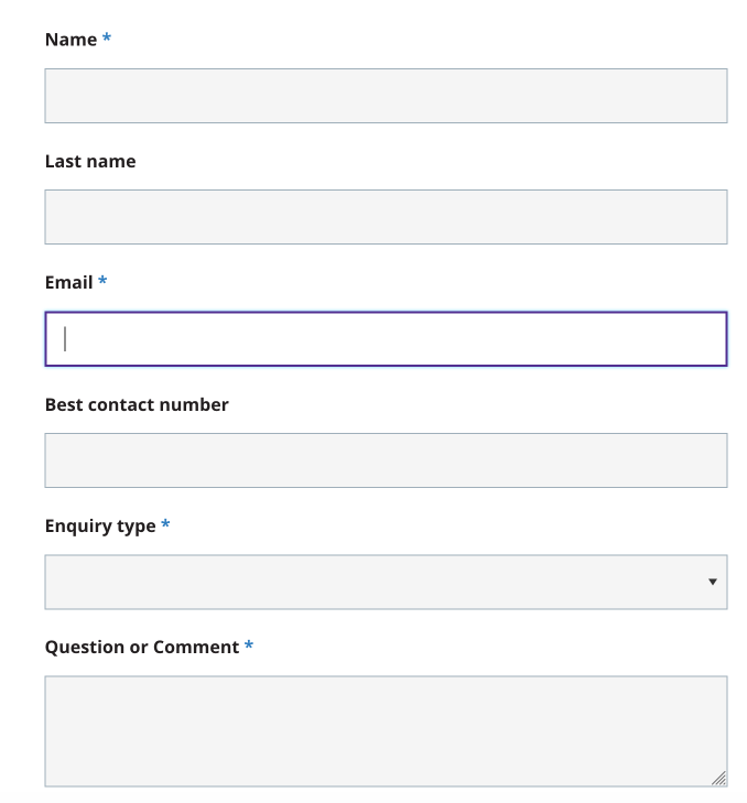
Forms
I have to throw in some serious love for the Contact form on Parramatta’s website. The highlights:
- The field labels are above the form fields which visually makes it easier to read and understand.
- The selected field is highlighted with a bold purple line making it very obvious where you are in the form.
- Color contrast is, of course, done well.
- I can use my keyboard alone to navigate this form, even the drop-down and the Google reCAPTCHA!
- The error messages are very obvious – they use both color and text to indicate the errors making it very easy to understand and fix.
My Mini-Audit Accessibility Score: A+
They aced it! I am so happy to have found this site so that I can reference it in my own design work with future websites.
We have an upcoming webinar on Accessibility in Web Design if you’d like to learn more from our team! Click here to register.
We also routinely do accessibility audits, so contact us if you would like us to look at your website!